Singapore's OCBC Bank
The Singapore OCBC Bank’s website gives visitors and
customers the opportunity to explore a range of the
bank's products and services
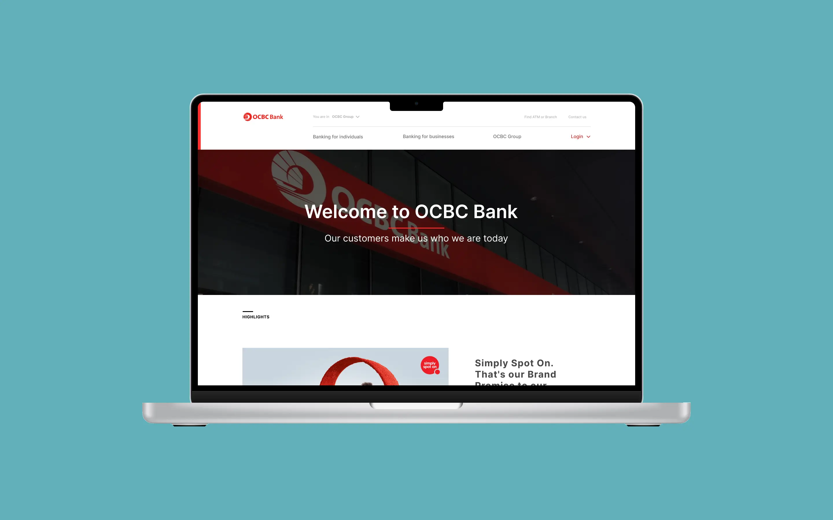
Singapore OCBC Bank's Website
The OCBC Bank website allows users to discover a wide
range of personal and business banking services. Our task
was to enhance usability and reduce user friction,
particularly on mobile and desktop navigation elements
The Team
This was a collaborative project with another UX Designer
during my time at Greenie Web. We worked together from
research through to ideation and prototyping
Methodology
Design Thinking | Heuristic Evaluation | Contextual
Enquiry | User Survey | Comparative Benchmarking
Challenges
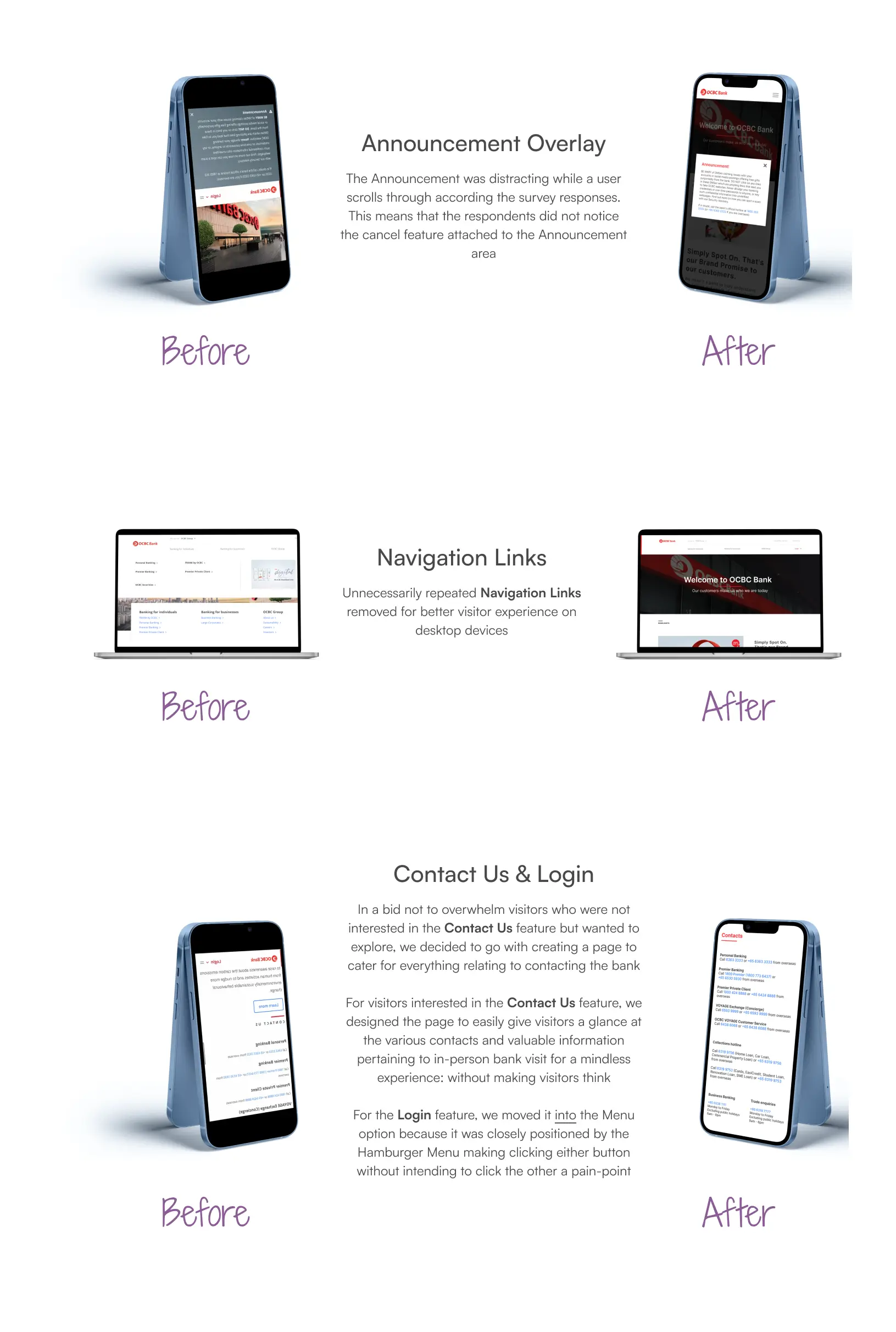
We identified key issues through a user-focused audit:
- An overly dominant Announcement section on mobile
- Redundant Navigation items on desktop
- The Contact Us section was overwhelming on both the mobile and desktop platforms
Problem Statement
Daniel, a student in Singapore, seeks a low-maintenance
bank account that still offers meaningful benefits. The
current site structure makes this hard to discover and
compare efficiently
Company Profiling
OCBC serves over
three million customers across Singapore,
Malaysia, Indonesia, and China — offering Wealth
Management, Loans, Deposits, and Trading Services. It
ranks among the top three consumer banks in Singapore,
known especially for leadership in Home Loans and Wealth
Products.
.png)
Research/Analysis
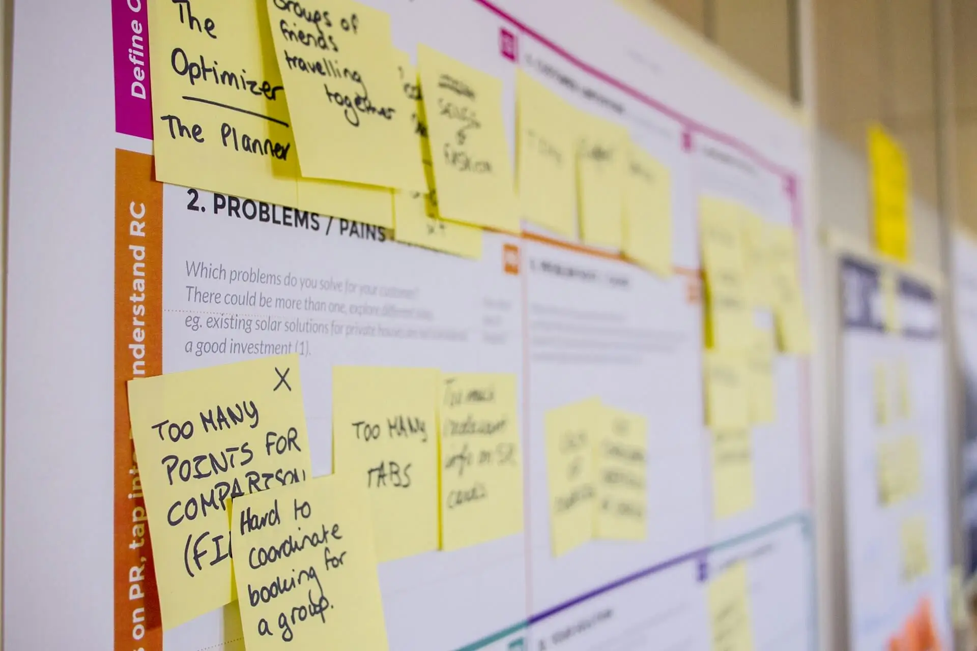
UX Audit
We conducted a heuristic review to assess the usability
of the site across devices. This helped us pinpoint
immediate friction points in navigation, information
structure, and overall experience.
User Interview
Using a qualitative approach, we distributed surveys
(via Google Forms) targeted at residents of Singapore —
the bank's core audience. This helped us factor in
regional behaviours and cultural context while gathering
insights on how users interact with key site features.
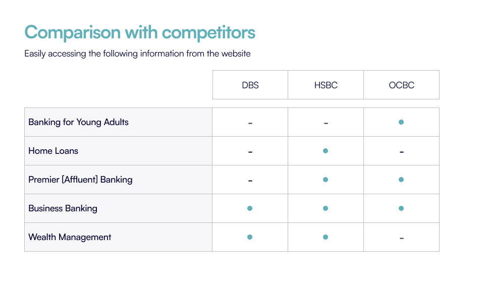
Competitive Analysis
We compared features on each competitor's website
and identified inspirations for Singapore OCBC Bank’s
website on mobile and desktop devices. After
examination, DBS Group and HSBC Singapore were in close
competition with the bank. We concluded on the overall
Navigation process to bring a more seamless user
experience.
Goals
We did not need to draw up from scratch different
Information Architecture versions but we concluded on
implementing the following solutions in redesigning the
Navigation:
.webp)
Personas
Frustrated Daniel
Daniel, a student aged 24, wants to know more about
the service offering but is frustrated with
Announcement section fixed to about half his
phone's screen size
Irritated Grace
Grace, aged 45, is helping out her boss who is an
Affluent suggest a reputable organisation to meet his
Private Banking demands but she is irritated by the
unnecessary Navigation links on the website
Wireframes
.webp)
High-Fidelity Prototype
Research Validation
Some feedback from user testing are:
Mobile
- Version Two is actually the best for the Announcement
- For the actual site, the font size could be smaller
- Contact Us... could be a smaller font
- Contact Us, Investor... could be organised as two columns to take up less Footer space
Desktop
- Login should be more accessible by putting it at the top (above the search engine)
- Footer background could be different
- The expansion of tab under login could be vertically displayed because there are too many options and it looks a bit messy
- No need for there to be a highlights tab if it is the only thing displayed
Conclusion
The following success metrics were achieved:
- Making the Announcement area less distracting for website visitors
- Removing unnecessary Navigation Links for an improved user experience
- Offering website visitors a mindless experience in having a glance at the Bank’s Contacts
Following the Test feedback, there would be need for the
design to be further improved.
Communication is very essential to the success of a
project. I realised that clear communication with my
colleague would save a lot in both time and resource(s).
📸
Credits: Daria Nepriakhina, Paola Aguilar & Warren
Wong via
Unsplash
Ready to move forward?
If you need your website to do real work, leave a message
about where you are and what you’re trying to build or
fix. I aim to respond within one business day